MUNCHH
Quick and Easy Meals
TOOLS
Figma
ROLES
Research
Prototyping
TEAM
Rovid Chavez (myself)
TIMELINE
Oct- Nov2023
Overview
Munchh is a mobile app directed towards a younger audience, such as teenagers, to learn how to cook.
This project intends to help users the importance of cooking tools, show a broad range of recipes for any experience level and lastly, demonstrate visually how to make the meals with easy to follow instructions.
My Goals
Teach the user about cooking and Tools
Have a variety catalog of options for the users
Research
My research first centered around the competition space in order to understand how other apps are addressing similar issues. I took a look at more than 10+ apps in both apple and android platforms, to narrow down on my goal.
Findings
A lot of the competitions over complicates the app with multiple steps
Many require a subscription and a long sign in process
Quite a few don’t inform the user about the tools they use
Using Human Centered Design
The objective was to create app that that is intuitive and efficient without the excessive elements that take away from the user. By focusing on empathy for the user, I identified problems, pain points and unmet needs while coming up with a solution, that is how Munchh came to be.
Creating a Structure
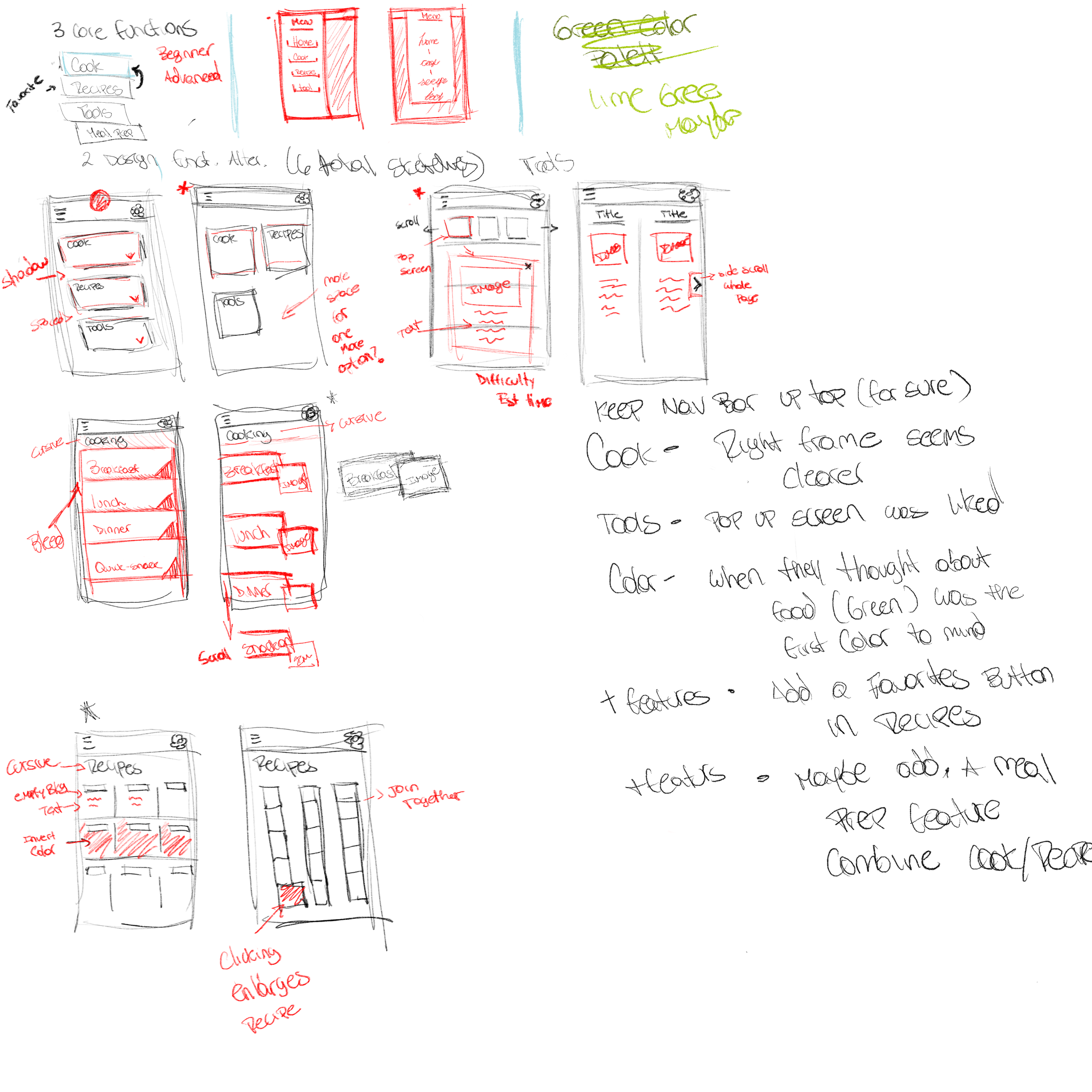
These are primary sketches organizing my ideas on how to tackle the problem. I had 3 core functionalities to get started with: A Cooking page, a Recipes page and lastly a Tools page. During our critique sessions I would ask as many questions and inform my classmates about the idea. Received a lot of feedback and with that I move on to the next stage.
Understanding What is Intuitive
Low-fidelity prototyping testing allowed me to better understand how user expected to complete the task I created. By initially seeing their visceral reaction and how they would proceed from one page to the other I could adjust my foundation to something more realized and high fidelity. One of the priorities when developing each page was sticking to Mille’s Law rule about memory. I made sure to not exceed the number elements a page has to affect the user working memory.
The Prototype
This high fidelity prototype is a combination of critiques, research and design principles which lead to the successful creation of Munchh.
Here are the core functionalities of the app. Many of the feedback wanted the long rectangular cards instead of the original square cards.
Navigating the App
This is the tool functionality which allow the user to be informed about any cooking tools of their choice.
This is the recipes functionality which allow the user to find and save any recipes of their choosing.
Lastly, we have the most important section of the app, the cooking section. While one of the task of this app was to be a learning experience, nothing teaches better than a little hands on. It is a simple task of choosing from four options, Breakfast, Lunch, Dinner and Snack-on. After selecting the appropriate meal time, you can chose what variety of options based on your previous selection. To conclude this page, you have the guide. It will provide you with visual on how to cook, a check list of ingredients so you don’t miss a thing and a set of instructions. ( Click to view Prototype )
A Quick Style Guide
I kept the base to very earthy tones, many of them being hues of green and a couple of other colors to brighten up the design. I choose orange as one of the base colors because it brought forward warmth and enthusiasm. Green gave it a more fresh, healthy and natural look that most cooking or eating apps have. I kept the text the traditional black to keep it grounded and a white background with a leaf silhouette to represent that freshness of a clean kitchen.
How Usability Might Be Improved
Issues to Address For the Future
A filters option to help narrow down the meals or recipes the user might want
A rewards system that would incentivize the younger audience to come back and use the app more
More interactivity within each page. Some pages might seem bare and could use more flare
An effective way to search specific keywords on the app, like a search bar
Looking Back
I went into this project believing that I could make anything I set out to create, but I did not think about the main limiting factors, which are my level of skill, adaptability and how those expectations of design harm the Human Center Design concept. I manage to take a step back after doing some rough sketching of my ideas and decided to really focus on the user, not my needs to create. I am happy to say that I learned a lot of prototyping as the project came along, and that my imagination was no longer such a limiting factor to my design.
I am very happy I managed to work on such wonderful project because I for one love to cook and I hope others get to enjoy it as well.


